After almost ten years, Filou was given a thoroughly revamped identity. An anniversary is the ideal moment to evaluate, refine and look ahead. The redesign builds on the existing recognisability, but sharpens the character and prepares the brand for the next phase, both visually and in terms of content.
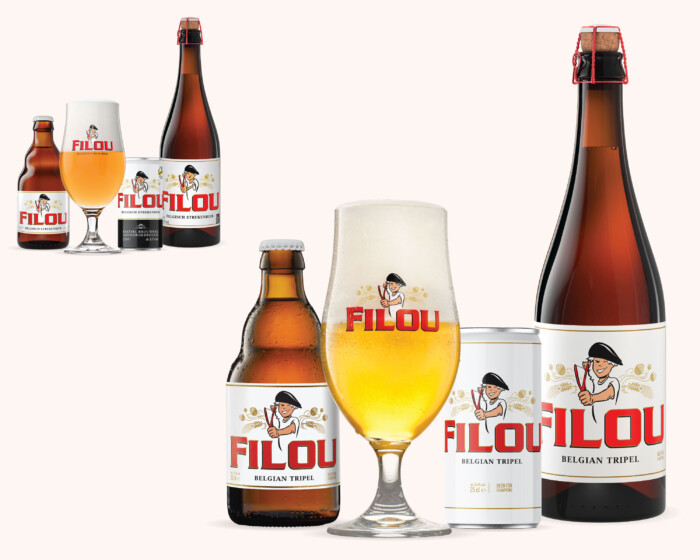
Filou Belgian Tripel - Packaging design
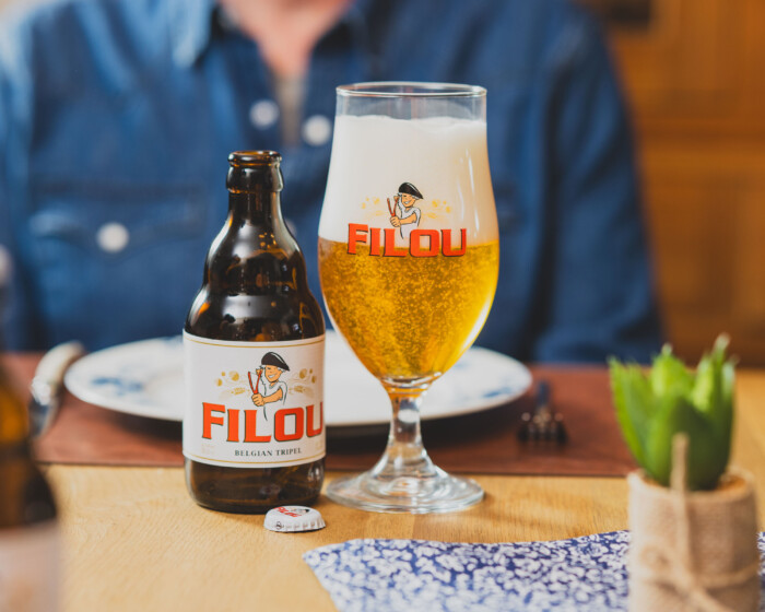
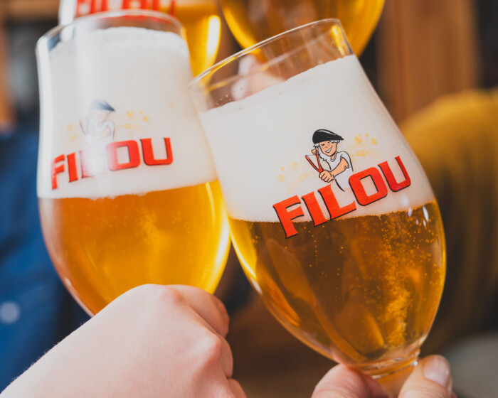
Belgian beer brand
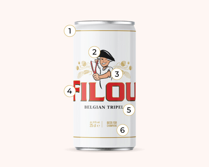
The iconic Filou character underwent a subtle makeover:
1. Sleek white design with a gold edge.
2. More expressive emotion: sparkling eyes and a broad smile.
3. No more weak arms!
4. Less hard and angular font.
5. New tagline "Belgian Tripel", now clear both home and abroad.
6. New slogan "Beer for Champions", as Filou has become one with the world of sport.
Realisation within the design team of Kasteel Brouwerij Vanhonsebrouck