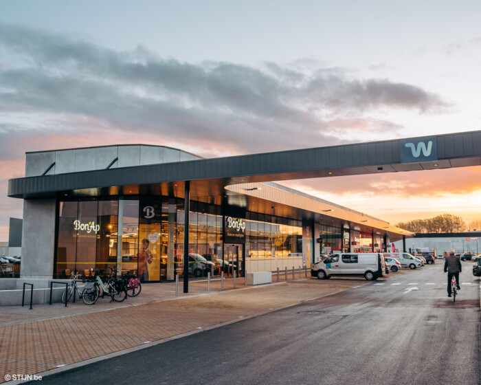
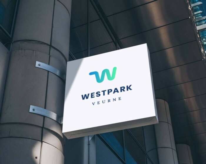
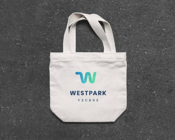
Westpark Veurne - Corporate identity

Shopping complex

Carbon-neutral

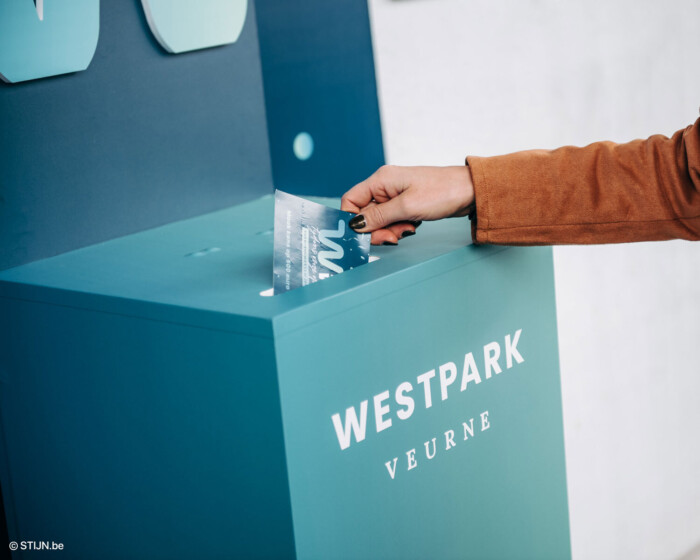
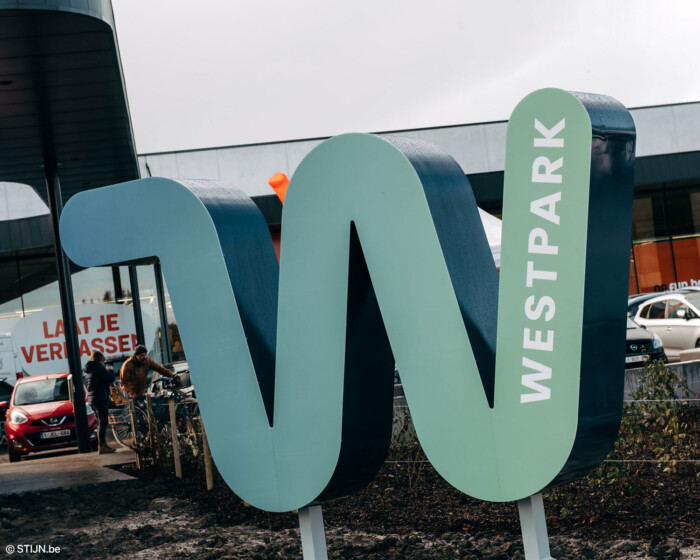
Westpark is one of the first carbon-neutral shopping parks in Europe. Blue and green were chosen as the basic colors because they fit the vision of the complex. Westpark is progressive and modern, as is the logo. The logo contains the "W" of "Westpark", the "V" of "Veurne" and simultaneously depicts a shopping cart, with the handle on the left.

Westpark is an elegant and informal park. The logo contains predominantly round shapes because Westpark is very flexible. It is easily accessible, contributes to nature with its water-permeable parking lot, provides employment, etc.

Westpark logo dark
Westpark building LR

A corporate identity that comes to life

The Westpark Veurne shopping complex is a realisation of Pattim bvba and Pano Real Estate, both loyal clients of Kirsten Graphic Design. After the delivery of the corporate identity, communication agency Wisely from Kortrijk took over part of the account because it became too large. Now Kirsten Graphic Design is working with Wisely to bring the corporate identity to life.

Westpark signage LR
Westpark tote bag LR
Westpark inauguration LR
Westpark contest LR
Westpark big w sign LR
Westpark tshirt LR