St-Louis - Packaging design

Belgian beer brand

The rebirth of St-Louis

St-Louis, the first West Flanders lambic beer, was born in 1957 as a rebellious counterpart to the Brussels lambic tradition. Whereas it was believed that lambic could only originate in the Zenne Valley via wild fermentation in the Brussels air, Brouwerij Vanhonsebrouck in Izegem proved otherwise. Despite criticism from traditional brewers, St-Louis continued to brew with respect for the craft as well as with idiosyncratic daring. What started out controversial grew into an established name. But after years in the lee, it was time for renewal. St-Louis makes a striking comeback, with a strong graphic story. The new look puts craft, history and premium character centre stage, ready for a new generation of beer lovers in Belgium and far beyond.
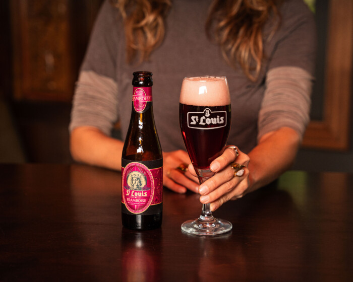
St Louis rebranding web bottle framboise 2
St Louis rebranding web bottles

A visual identity with character

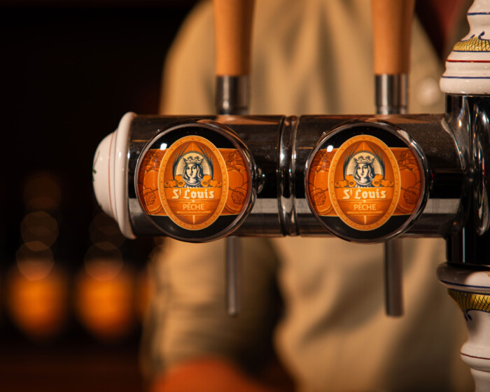
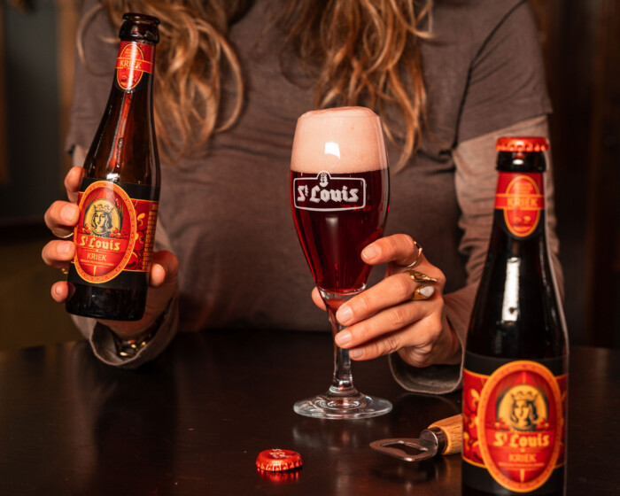
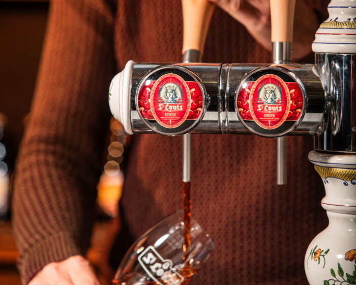
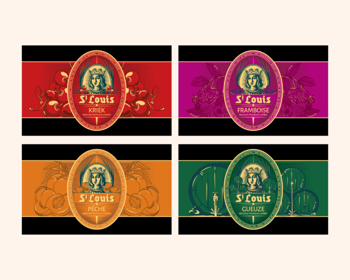
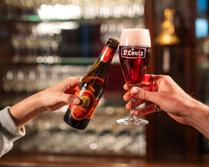
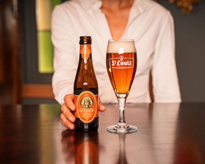
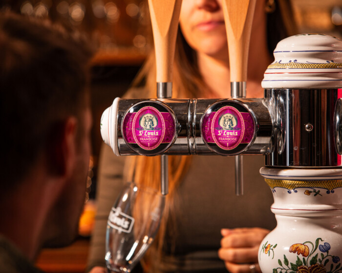
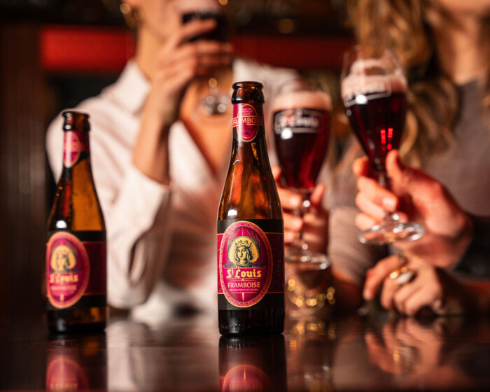
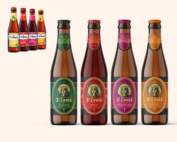
The old, rather neutral label was replaced by an illustrative medallion, unique per flavour variant. At its heart is the original St-Louis logo, refreshed and adapted to a contemporary style. For each flavour, the medallion is surrounded by illustrations such as fruit or wooden barrels, referring to the character of the beer. Together with rich colours and elegant typography, this creates a premium, timeless look. This rebranding strengthens recognisability, brings calmness to the shelf and exudes confidence without denying the brand's roots.

The return to the general public

St-Louis has long been more than a niche product. The repositioning focuses on visibility, activation and emotional connection. A good example is the renewed link with Club Bruges. In the '79-'80 season, St-Louis was Club's shirt sponsor, as a counter to Brussels-based Belle-Vue, which sponsored Anderlecht. What began as a sporting duel thus took on an extra layer: the battle between two lambic breweries on the football pitch. The press soon renamed it the legendary “Gueuze War”. To commemorate this piece of history, a limited edition retro shirt was developed. A nod to the past and a clever bridge to the new St-Louis brand story.

St Louis rebranding web Club Brugge
St Louis rebranding web scabal

From Izegem to Shanghai

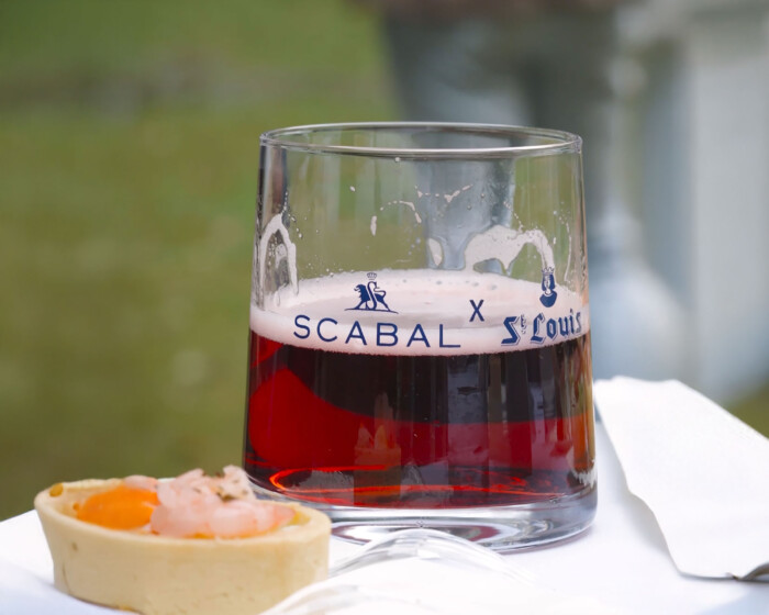
St-Louis is also scoring high internationally. In China, the brand is growing rapidly thanks to presence at exclusive events such as the Shanghai Summer Garden Party and the International Dragon Boat Festival. Through collaborations with luxury brands such as Scabal and a unique “St-Louis x Scabal” beer glass, the beer gets a new image: artisanal Belgian and lifestyle-worthy. The rebranding helps carry this story visually with class and conviction.

> Click here for the full brand book!

Product pictures: Videofy

St Louis rebranding web tap Peche
St Louis rebranding web bottle kriek 2
St Louis rebranding web tap Kriek
St Louis rebranding web flavours
St Louis rebranding web bottle framboise 3
St Louis rebranding web bottle kriek 1
St Louis rebranding web bottle peche
St Louis rebranding web tap Framboise