Simon & Kirsten

Wedding stationery & decorations

Thought out down to the smallest detail

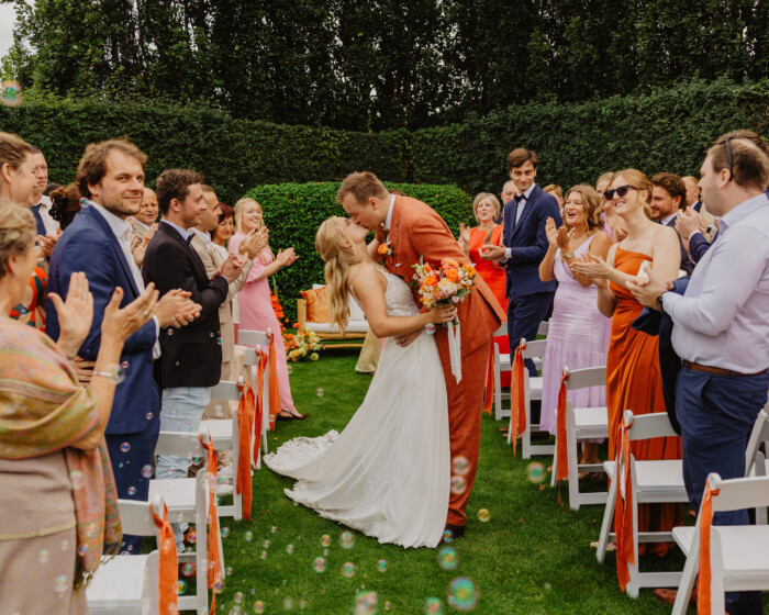
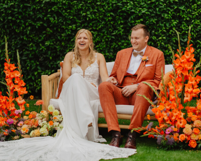
On 12 September 2026, Simon and I tied the knot. As a graphic designer, I naturally couldn’t resist designing every visual aspect of our wedding myself. From the very first ‘save the date’ to the very last table number: everything was designed in line with a single, cohesive wedding theme.

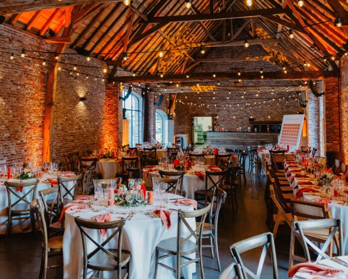
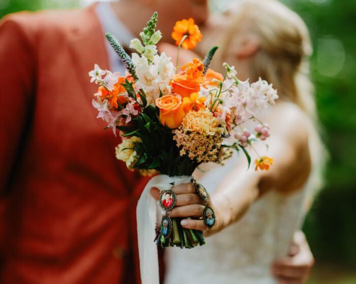
Warm shades of orange, subtle powder pink, unique paper types and refined details formed the basis of a personal identity that ran through the entire celebration. Not only in the printed materials, but also in the flowers, table decorations, fabrics and even the lighting.
SK uitnodiging 4
SK STD 4

A lasting first impression

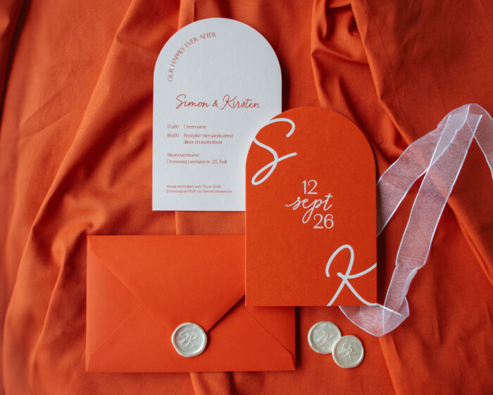
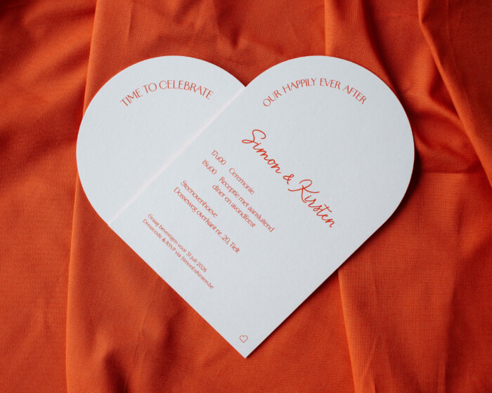
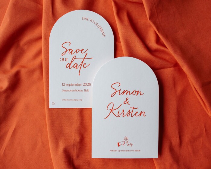
The ‘save the date’ card was the first glimpse of our wedding branding. I opted for a minimalist, arched design, made from two layers of Gmund Colors Mat 71 (300 g), glued together. The paper has a very subtle powder-pink hue that complemented the warm orange typography beautifully.

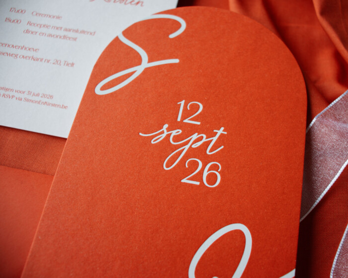
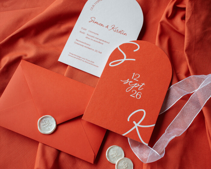
For the invitation, I wanted something a little more eye-catching. For this, I combined Materica Terra Rossa (360 g) with the same powder-pink Gmund paper. Our initials and wedding date were given a refined finish in white foil, combined with a slightly recessed embossed effect.

Together with the printer, I carefully coordinated the orange paper, the envelopes and the printed typography to avoid any variations in the shade of orange. This ensured that all the elements came together to form a harmonious whole.

SK uitnodiging 7
SK uitnodiging 6
SK koppel 1
SK hartje

A seating plan full of personal stories

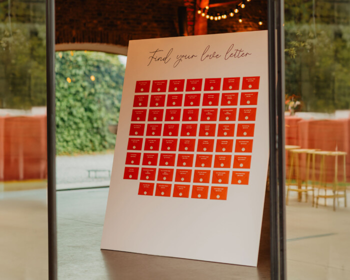
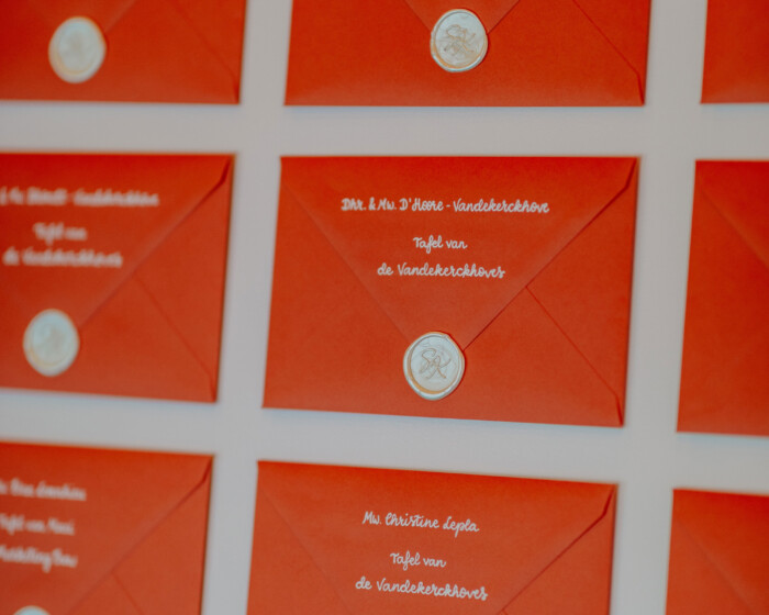
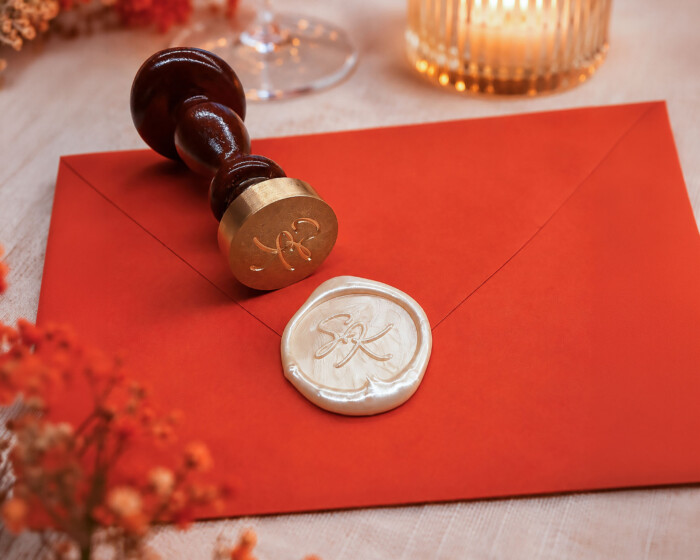
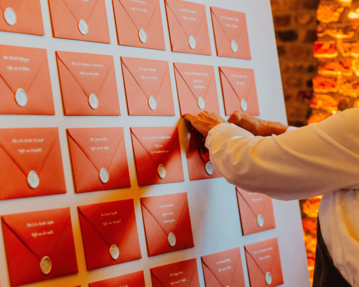
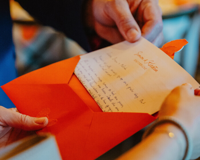
Instead of a traditional seating plan with names and table numbers, I opted for an original ‘love letter wall’. Each guest received an envelope bearing their name, table number and a wax seal as a finishing touch.

Inside was a personal, handwritten letter, written especially for that person or couple. In this way, a practical part of the celebration was transformed into a special experience and a tangible keepsake for our guests.

SK brieven 5
SK brieven 1
SK waxseal
SK brieven 4
SK brieven 3
SK tafel 1

The visual identity brought to the table

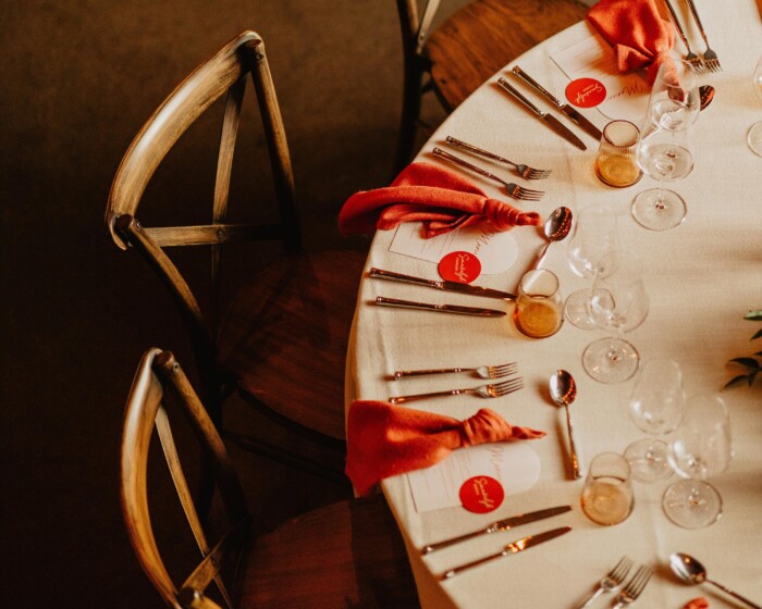
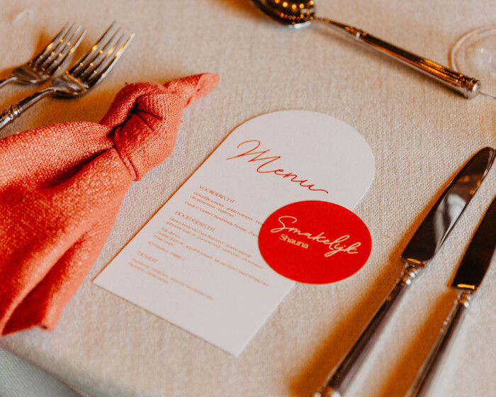
Our visual identity also came to life in full on the banquet tables. The menus were printed on the same powder-pink Gmund paper and paired with round, personalised place cards.

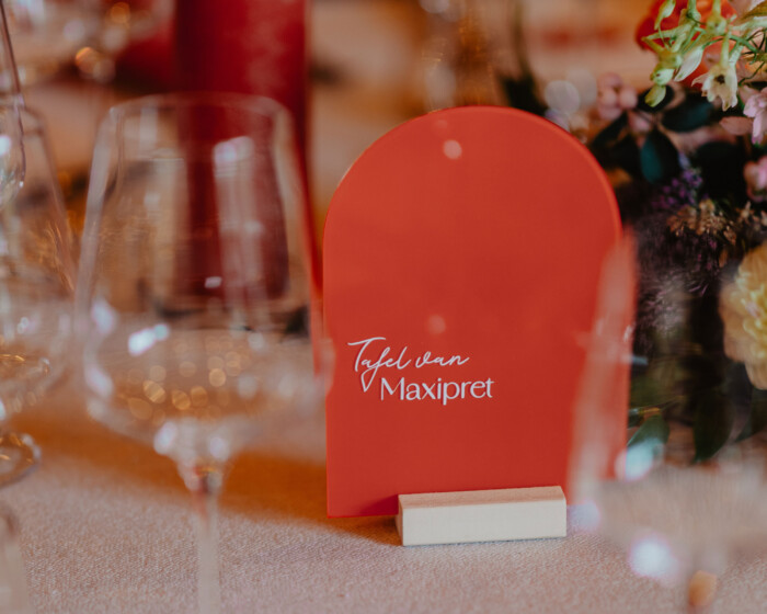
I made the table numbers myself using transparent plexiglass shapes, orange acrylic paint and cut-out lettering. Together with the carefully chosen napkins, candles and floral arrangements, they created a cohesive table setting.

SK tafelnummer
SK menukaart 1

Small details with great significance

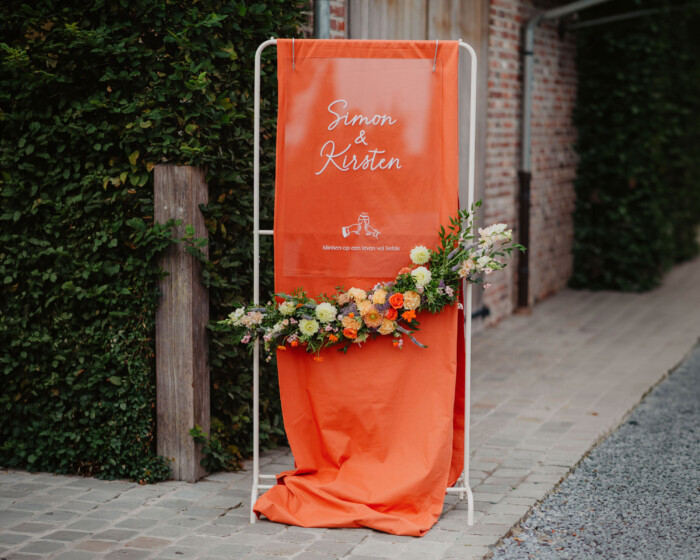
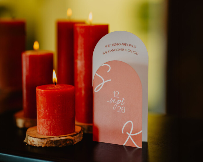
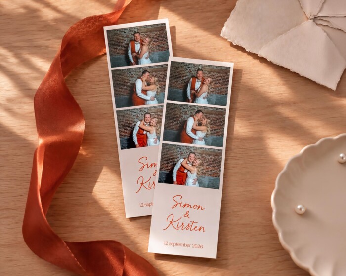
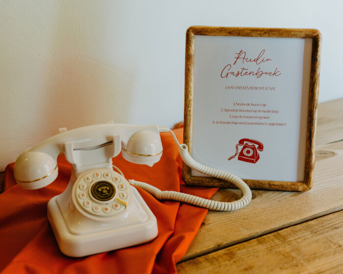
As well as the traditional wedding stationery, I also designed the drinks menus, photo booth strips, the welcome sign and the instructions for our audio guestbook.

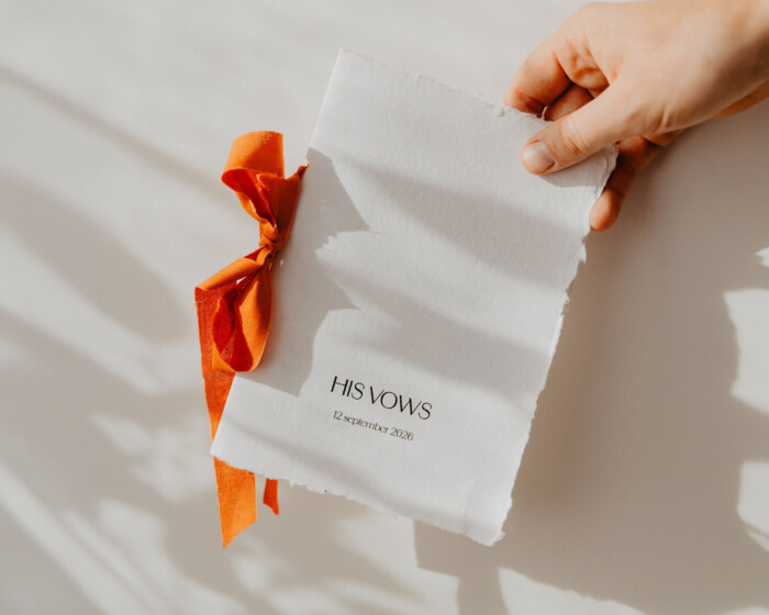
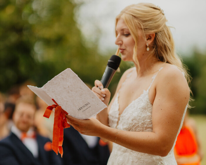
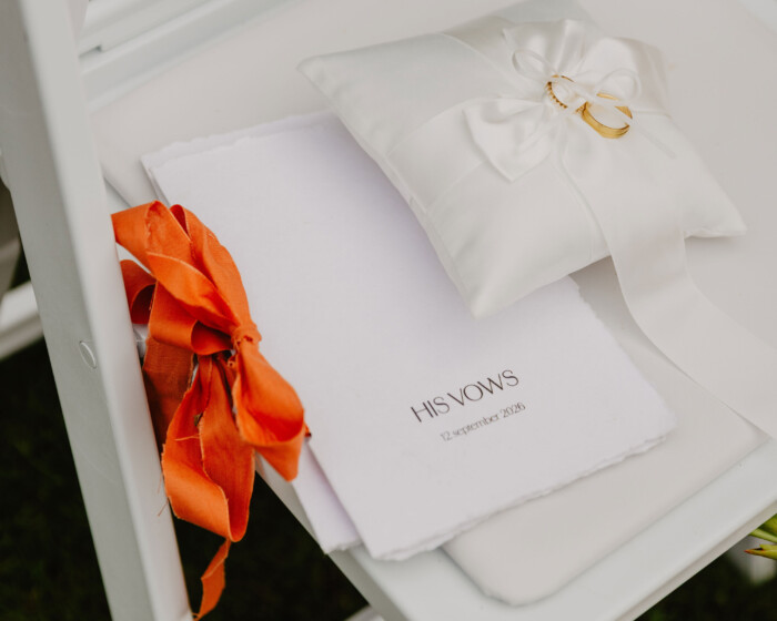
A special feature was our vow booklets. For the covers, I chose handmade paper made from cotton fibres, with each sheet being unique thanks to its characteristic deckle edges and natural, organic texture.

The inside pages featured subtle ruling, and the booklets were bound together with ribbons made from the leftover fabric from our welcome sign. In this way, our wedding branding was reflected even in the smallest details.

SK welkomstbord
SK drankkaart 2
SK photobooth
SK audiogastenboek
SK geloftenboekje 1
SK geloftenboekje 2
SK geloftenboekje 4
SK zaal 2

From design to experience

I didn’t just design many of the elements; I also made them myself. From sealing dozens of envelopes and putting together the love letter wall to crafting the table numbers and vow booklets.

The result was a wedding where all the visual elements were perfectly coordinated. A personal identity that went beyond the printed materials and helped shape the atmosphere and experience of our big day.

Because when all the details come together visually, memories become even more vivid.

SK hangertjes boeket 1
SK koppel 2