Platform Padel - Corporate identity

Padel club

The origins of Platform Padel

Platform Padel was born when 4 colleagues of Decathlon Kortrijk decided to respond to the padel hype by installing two padel courts on the Decathlon site in Kortrijk.

They chose the name 'Platform Padel' by returning to the 1920's where 'Platform Tennis' was one of the precursors of padel. In addition, the location of Platform Padel is on 't Hoge, the platform of the city of Kortrijk.

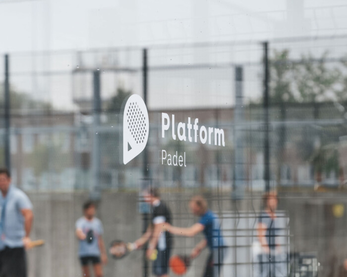
Platform Padel has a friendly, conversational, accessible and trustworthy personality. There is no membership system, which means that everyone, including people who want to try padel one time only, can come to Platform Padel.

Platform padel banner LR
Platform padel colors LR

About the logo

For platform padel, I created a corporate identity based on blue and pink, two colors that can be associated with the colors of padel courts. In the logo, the pink and blue blend together, showing that men, women and everything in between are welcome at Platform padel.

The logo represents the 'P' of 'Platform' and 'Padel' and at the same time represents the widely known padel racket. The logo was designed in such a way that the icon stands out even without the mention of 'Platform Padel'. The logo perfectly visualizes the friendly and trustworthy personality of Platform Padel.

Besides the logo and corporate identity, a banner for the courts and a social media template package with no less than 30 unique social media post designs were created.

Thanks to the combination of consistent, professional branding and active marketing and communication, Platform Padel has become a valued asset in Kortrijk after just a few months.

Platform padel social media LR
Platform padel raamsticker
Platform padel logo