The story behind the design
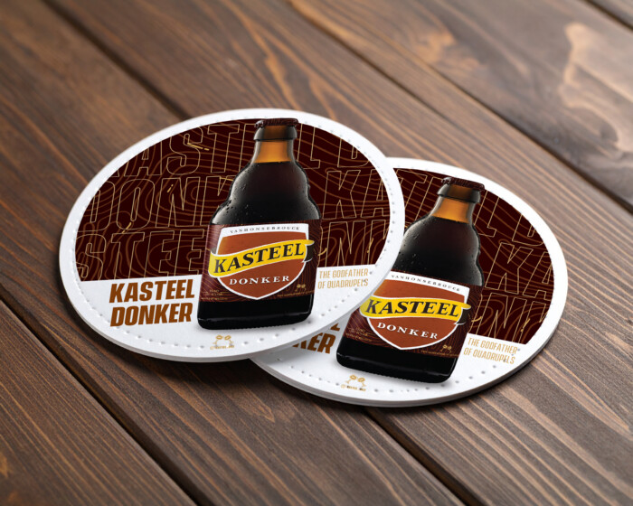
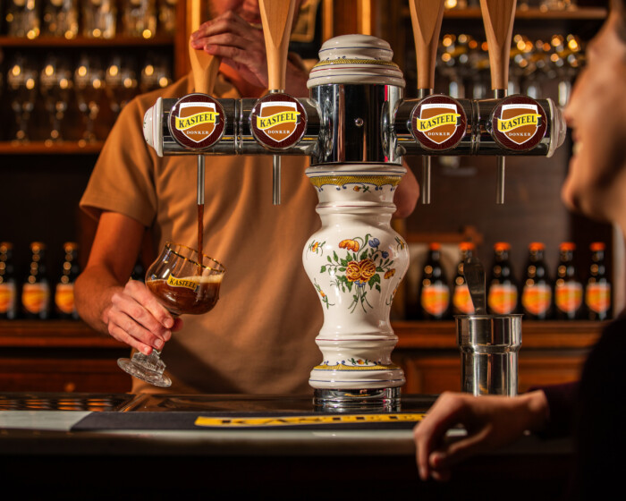
Kasteel Donker's target audience consists of seasoned beer lovers: people with a past, a taste shaped by experience. They are the Godfathers among beer drinkers. The new slogan, ‘The Godfather of Quadrupels’, also arose from that thought. I wanted to capture that concept visually in a design that feels robust, timeless and layered.
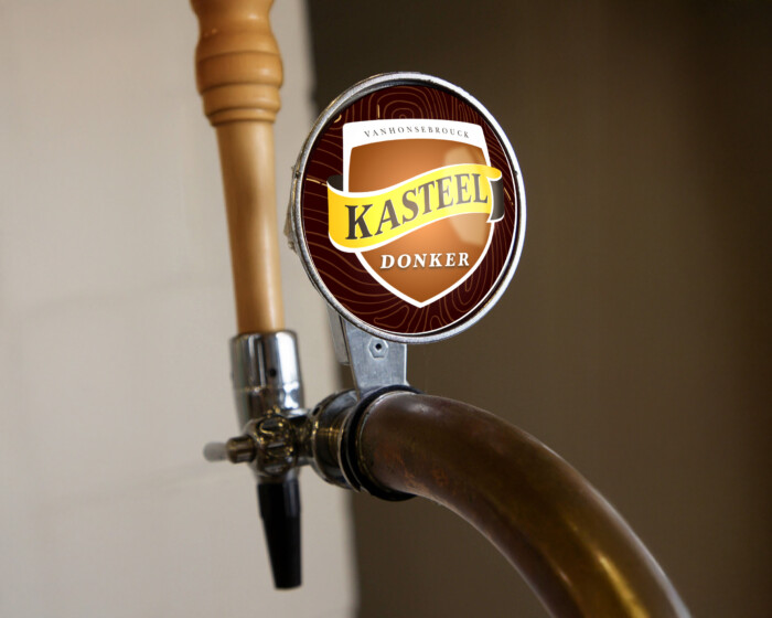
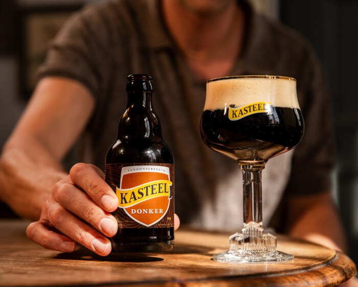
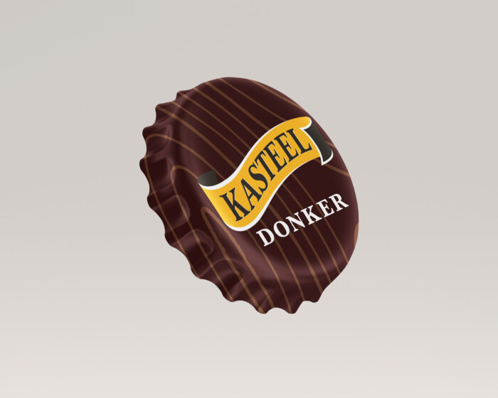
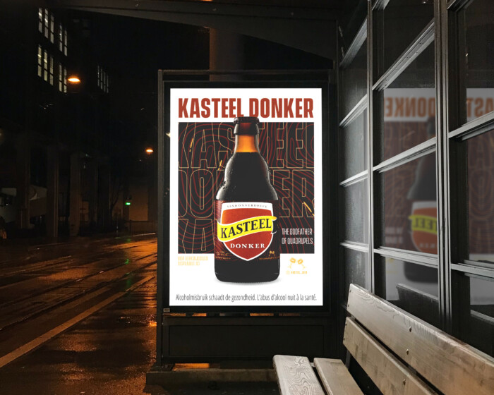
The pattern on the label is reminiscent of annual rings in wood. They symbolise a rich history, accumulated experience and the steady growth of Kasteel Donker into a permanent fixture. The solid core represents the solid foundation on which the brand is built.
On closer inspection, you recognise the outline of a fingerprint, a subtle reference to the unique DNA of this beer: a distinct character with an unmistakable identity, just like the brewery itself.