Bacchus - Packaging design

Belgian beer brand

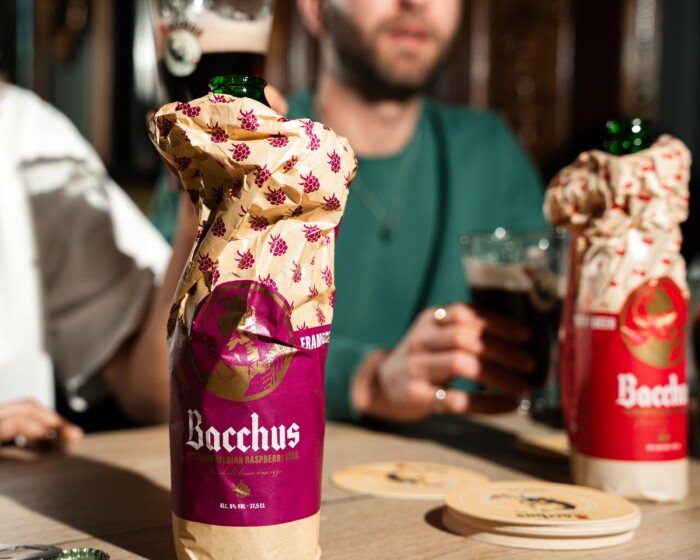
A new jacket for an iconic beer

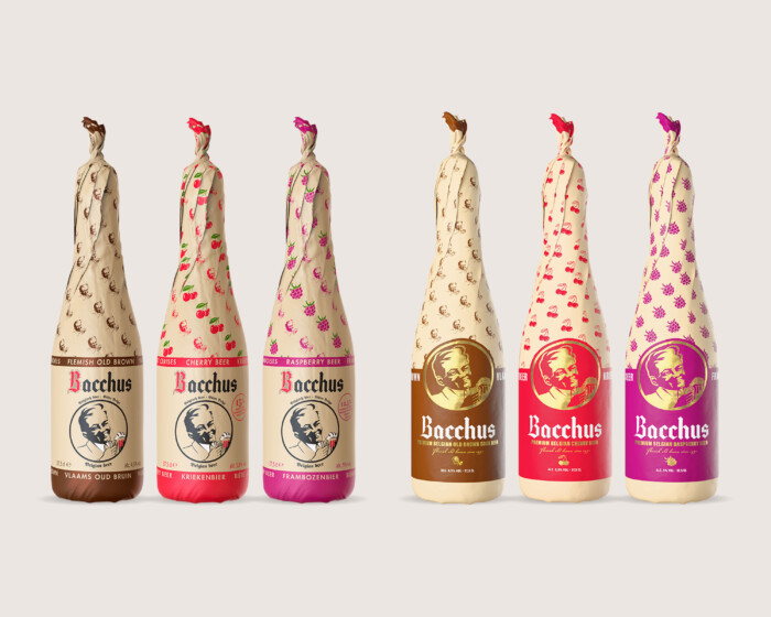
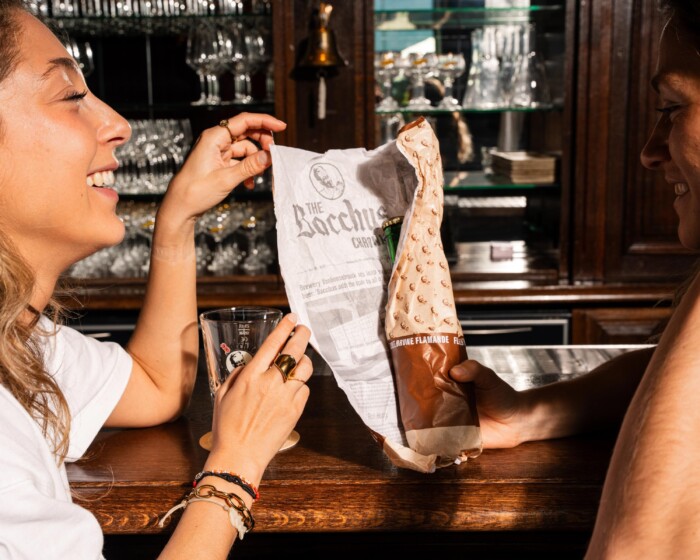
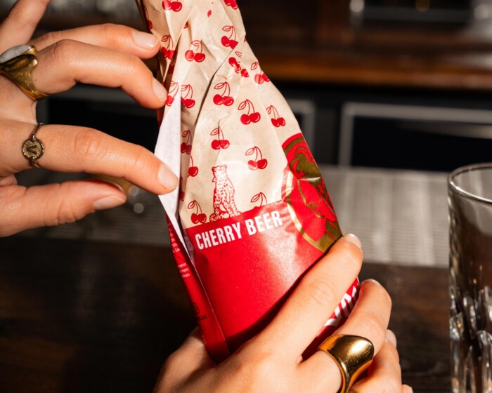
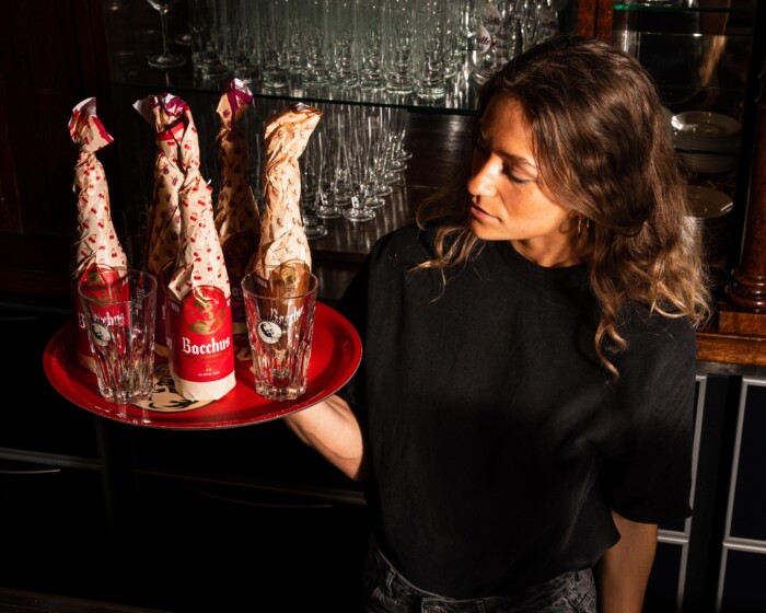
For Bacchus, Brouwerij Vanhonsebrouck's quirky beer, it was time for a visual upgrade. The existing paper wrappers felt outdated and lacked a story. While respecting the craft character, the brewery opted for a rebranding that brings more tranquillity, repetition and brand consistency. The three flavours were each given a recognisable identity, with subtle patterns and a central circle in which the Bacchus portrait shines. The new packaging is visually more powerful and attractive on shelf, with more modern typography, richer colours and a luxurious gold touch. A contemporary interpretation of tradition that puts Bacchus right back on the map.

Bacchus voor na
Bacchus chronicle

Unwrap the Myth, a package full of experience

The slogan ‘Unwrap the Myth’ is more than a wink. Opening a Bacchus bottle becomes a little ritual: a moment of curiosity and surprise. The hand-wrapped packaging turns each bottle into a gift, with the added surprise of the ‘Bacchus Chronicle’ on the inside: a fictional newspaper article that interweaves the brand with historical events. This storytelling not only ensures strong brand recognition, but also invites interaction and experience. Thus, drinking Bacchus becomes more than just taste: it becomes an experience that sticks.

The leopard, the pet of Bacchus

A special detail on the new packaging is the little leopard. According to Roman mythology, these wild, elegant animals accompanied the god Bacchus on his feasts. The leopard symbolises mystery, freedom and zest for life, which fits perfectly with the brand's character. By adding this visual hook on the packaging, Bacchus adds another layer of meaning. It creates recognisability as well as reinforcing the mythical world in which the brand is set. In this way, Bacchus not only builds a strong packaging, but also a rich, layered brand story.

Bacchus leopard
Bacchus plateau

Added value for brand and brewery

The packaging reworking strengthens Bacchus' look and positioning: artisanal, festive and unique. Thanks to the new visual identity, the three flavours can be more clearly distinguished and the brand appeals to a wider target group. For Brouwerij Vanhonsebrouck, this is a smart investment in future-oriented brand thinking. The revamped look fits seamlessly into shop shelves, campaigns and social media, while also forming the basis for more storytelling, seasonal promotions and brand activations. In this way, Bacchus continues to grow into a unique beer brand with character, roots and a story that continues to captivate.

> Click here for the full brand book!

Bacchus leopards
Bacchus bottle